I'm Jin, and I'll be working on the designs for the Stack Exchange sites as they graduate from the beta phase. Each site will have its own unique theme that will reflect its topic. However, all sites will share quite a bit of common elements so they feel like they're part of the Stack Exchange family.
First, thank you for starting the design discussion thread early. I read every suggestion and comment, they were helpful.
For every Stack Exchange site I design, The first thing I do is to come up with a few words that describe what the niche topic is about. The design should capture those words through visual language and invoke the right emotional response. For IT Security, I came up with "protection," "guardian" and "technology." IT Security professionals have been on the front line against malicious cyber acts for a long time. With the recent high profile hacking events, your role is more important than ever.
Logo
There are two commonly used motifs for security: padlock and shield. I feel a shield is a better representation of IT Security. It's not just about locking the door, but also about constantly defending. The shield metaphor is used for a lot of security related sites and software, how can we make our shield be unique and memorable?
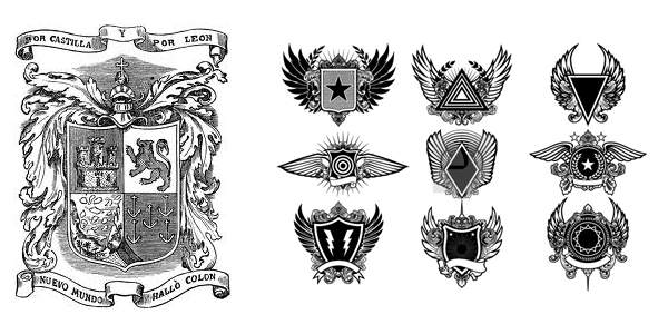
I've always been a big fan of the Heraldic designs. I believe a modernized version of the coat of arms treatment is the appropriate approach. It invokes that authoritative and timeless feel.

Above is the grayscale logo I came up with. I chose the lion because it symbolizes strength and valor. The wings represent swiftness and protection.
The logo is not just used for the website. It's the visual identification this Stack Exchange community. It will be used in other mediums too. For example: social media icons, t-shirt, stickers, flyers, moderator cards etc.
Site Design
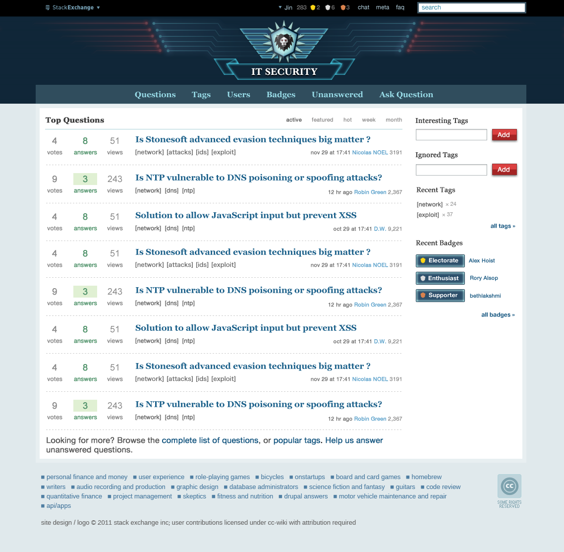 (click on image above to see the full res version)
Header

Here you can see how the logo is actually implemented on the site. I've added some design elements to it to show the technology aspect. The blue signals(defense) coming out of the emblem intercepting the red signals(attacks) conveys the protection aspect. Also the Tron-ish color scheme and the subtle scan-lines make it more "techie" too.
Color Scheme

I went with mostly blue shades for the site, with a dark red for accent colors. I feel these colors are fitting for enforcement.
Over all
The content area below the header is fairly clean. I didn't want to over decorate it. After all, people come to the site for its content, I don't think the design should overwhelm it.
I will be posting another screenshot of the individual question page on Friday.
Other Designs
As I mentioned above, the logo will be used for other materials as well. Here are some mockups of how it'd look on a t-shirt and sticker. (note: these are just mockups for now, I may make modifications to them later).


Feedback
I'm excited that Security.SE will be graduating soon, so an early congrats from me! Please let me know what you think of the design. I believe it works for the goals I mentioned.
EDIT
(by Iszi)
Jin gave us this preview of the "new" lion, in chat:

Also, he's said: "I'm aiming to launch the site tomorrow afternoon. around 4pm-ish, EST."
http://chat.stackexchange.com/transcript/message/1324190#1324190






 Nothing to see here. Move along, move along.